What Is a Moodboard and How to Make One? A Guide with Examples
A moodboard is a reference collection that gathers the visual direction of a brand or project on a single board. We explain what it is, why it works, and how to build one step by step with examples.
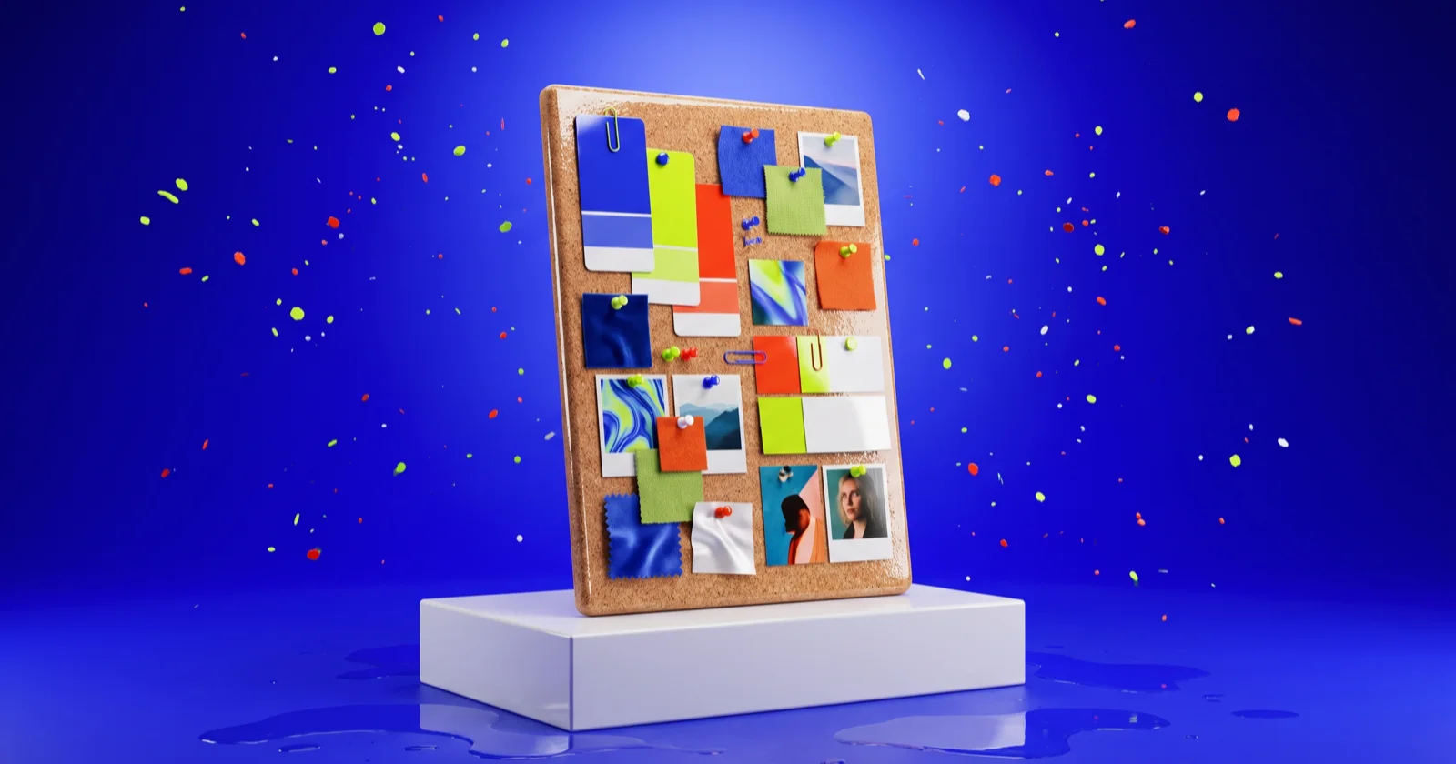
A moodboard is a reference collection that gathers the visual direction of a brand or project onto a single board; colors, typography, photos, textures and sample designs sit side by side. Its purpose is to visualize the question "what will this look like, what will it feel like" before a single design exists. Saying "modern but warm" in words means something different to everyone; a moodboard removes that ambiguity, letting the team and client agree by looking at the same image. This guide covers what a moodboard is, why it is the first step of the brand process, and how to build one step by step with examples.
Short answer
A moodboard is a reference board showing a project's visual direction: it gathers the color palette, typography, photos, textures and sample designs in one place. You make it before designing, to set direction and get the team and client onto the same image. Pinterest, Figma or Milanote build one in 30-60 minutes.
What is a moodboard for?
A moodboard solves three problems. First, a shared language: words like "vibrant", "luxurious" or "friendly" shift from person to person, an image does not. Second, speed: a team that clarifies direction up front starts from the right place instead of binning the first drafts; revision rounds drop. Third, safe decisions: the client approves a low-cost board, not a logo that took hours; if the direction is wrong, it is fixed before money is spent. In short, a moodboard prevents design's most expensive mistake, spending effort in the wrong direction, at the cheapest possible stage.
How to make a moodboard: five steps
A good moodboard is not a random pile of pretty images; it argues a point. These five steps turn a scattered inspiration wall into a tool that sets direction.
- Write the goal and the words: before adding any image, pick 3-5 adjectives (for example "bold, street, young, clean"). These words are the board's filter; you judge every image you add against them.
- Collect references: gather competitor brands, designs from other industries, photos, colors and typography samples. Collect widely in the first pass; cutting is easier than adding.
- Cut and group: throw out half of what you collected. Group the rest into color, typography, imagery and layout. A board usually needs just 3-5 colors, 2 typefaces and one consistent photo tone.
- Extract a core palette: reduce the dominant colors on the board to a 4-6 tone palette. The palette is the most concrete decision a moodboard produces, and it carries straight into the design.
- Add a short rationale: write 2-3 sentences under the board: "This direction gives an X feeling because...". A moodboard without reasoning cannot be discussed; with it, the board becomes a decision tool.
Common mistake
The most common mistake is cramming mismatched images onto one board because "they are all nice". A 40-image board pulling in ten directions is not inspiration, it is confusion. A good moodboard comes from cutting, not adding: keep trimming until a clear feeling remains.
Which tools? Pinterest, Figma, Milanote
The tool's brand does not matter; fitting your flow does. Pinterest is good for fast collecting and discovery; a keyword reaches a wide image pool quickly. Figma is ideal for teams who want the moodboard right next to the design file; you carry color and typography from the board into the design in one click. Milanote is built for presentation-grade boards that combine the moodboard with text, notes and flow. For a small job, a single slide or a Figma frame is enough; let the scale of the work pick the tool, not the reverse.
Where does a moodboard sit in brand identity?
A moodboard is not a brand identity, it is the identity's first draft. The order runs like this: brief and strategy, then moodboard (visual direction), then logo and typography, and finally the full identity guide. Jumping to a logo before the moodboard is approved is like driving without knowing where you are going. We covered that distinction, and how a logo is only one part of an identity, in logo vs brand identity, and the full process in how to create a brand identity. For refreshing an existing brand, see when to rebrand.
A moodboard is the cheapest agreement you make about direction before drawing the first line. An approved board means ten drafts you never had to throw away.
- from the poi369 design team
+What does moodboard mean?
A moodboard is a reference collection that gathers the visual direction of a project or brand on one board. By placing color, typography, photos and sample designs side by side, it shows what the work will look like before any design begins.
+How long does making a moodboard take?
A simple direction board takes 30-60 minutes. A brand moodboard that takes collecting, cutting and writing a rationale seriously needs a few hours of focused work; the real time is in cutting, not collecting.
+Is a moodboard the same as a mockup?
No. A moodboard is a reference board showing direction and feel, not yet a design. A mockup shows how the actual design looks on a product or screen; it comes after the moodboard is approved.
+How many images should it have?
Usually 10-20 well-chosen images are enough. Clarity matters, not count: if everyone who looks at the board gets the same feeling, you have the right number. Too many images is often a sign the direction is still unclear.
Don't miss these
How to Create Brand Identity: A Complete Guide to Building a Strong Brand from Scratch
Strategy, visual language, tone of voice, positioning - a step-by-step, concrete answer to how to create brand identity.
Logo vs Brand Identity: Time to Kill the Myth
The difference between a logo and brand identity is still widely misunderstood. Having a logo designed is not building a brand. Here is the real distinction - and why it matters.
When to Rebrand? 7 Clear Signs Your Brand Needs a Reset
Changing your logo is not rebranding. So when does a real brand transformation become necessary? Here are 7 clear signs telling you "stop, it's time to refresh."
Tell us your project
Got an idea, or a brand that's stuck? Grab a coffee - we'll blow up the rest.
Let's talk →